The Color Utility Blog
Insights and inspiration for the creative community.

In 2025, the app market is experiencing major shifts — the rise of advanced AI, deeper cross-device integration, stronge...

Streamline your workflow with our new export feature. This guide walks you through how to export your saved color palett...

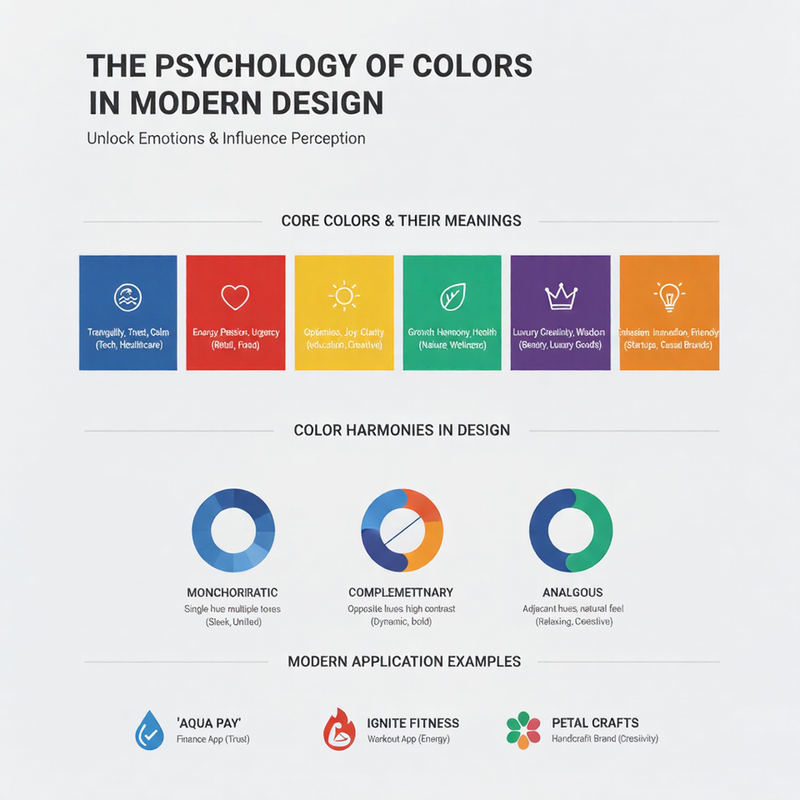
Color is a silent language that speaks directly to our subconscious. Before a user reads a single word on your website, ...

A brand's color palette is its visual heartbeat. It's one of the first things a customer notices and one of the last thi...

In the ever-evolving world of design, color trends serve as a visual barometer of our collective mood and cultural shift...

Gradients are back, and they're more sophisticated than ever. Once relegated to the design archives of the early 2000s, ...

As a designer or developer, you'll constantly encounter a trio of acronyms that define color on our screens: HEX, RGB, a...

Color harmony is the art and science of combining colors in a way that is pleasing to the eye. When colors are used harm...

In the fast-paced world of digital design, the right set of tools can be a designer's best friend, acting as a creative ...

Color temperature is a fundamental concept in color theory that plays a profound role in shaping the emotional impact of...

Inspiration for a great color palette is all around us, captured in the fleeting moments of a sunset or the vibrant chao...

In digital design, aesthetics and usability must walk hand in hand. A visually stunning design is ineffective if it is n...

In a world saturated with vibrant colors, there is a unique power in the understated elegance of neutral colors. Neutral...

Dive into the world of color theory. Learn how to use warm colors like reds and yellows to create energy and cool colors...

An accent color can make or break a design. Learn the art of using a pop of color to guide user attention, highlight cal...

Color choices are critical to UX. Discover how your palette influences user emotion, usability, and interaction, and lea...

Creating a dynamic yet harmonious UI requires balance. We'll show you techniques for pairing vibrant, energetic colors w...

Guide your users' eyes effectively. This post explores how to use color, shade, and saturation to establish a clear visu...

From poor contrast to color overload, many designs suffer from common pitfalls. We identify the top color mistakes and s...

The future of color is here! Discover our groundbreaking new tool that uses artificial intelligence to generate unique, ...

Never search for the perfect gradient again. Learn how to use our Gradient Lab to create, save, and organize a personal ...

Working between web and print? Our Color Converter tool makes it simple to translate colors accurately between different...

Stuck on finding the right complementary color? Our Smart Palette Tool uses color theory principles to suggest harmoniou...

A step-by-step guide on how to use our Contrast Checker to ensure your designs meet WCAG standards, making your websites...

Collaboration is key. Learn how to save palettes to your personal collection and share them with colleagues and clients ...

Break out of your creative rut! Discover how our 'Random' feature can spark new ideas by generating unexpected but harmo...

Your inspiration shouldn't be tied to one machine. Learn how to create an account to save and sync your personal color c...

Go beyond manual picking. See how our AI analyzes keywords like 'calm' or 'energetic' to suggest color palettes that per...

Look into the future with our forecast for 2026's biggest color trends. From biophilic design to new-age digitalism, see...

Color is a key element of luxury branding. We analyze how top brands like Tiffany, Hermès, and Ferrari use specific colo...

Dark mode is more than just a trend. We explore the best color palettes that work in dark UI, focusing on readability, d...

Nostalgia is a powerful design tool. Dive into the retro color trends from the 70s, 80s, and 90s that are making a huge ...

The best color palettes are often found in the world around us. Learn how to draw inspiration from nature, travel photog...

Gradients are more than just a color transition. Discover advanced techniques for using gradients to create depth, evoke...

Color palettes often reflect the seasons. We compare the bright, vibrant hues of summer with the cool, muted tones of wi...

The tech world has its own color language. From trustworthy blues to innovative purples, we break down the top colors us...

Filmmakers are masters of color. We analyze the iconic color palettes from famous movies and TV shows and show you how t...

From terracotta to olive green, earth tones are everywhere. We explore the psychology behind this trend and why these gr...

A cohesive color palette is key to a beautiful social media feed. Learn how to create and apply a consistent aesthetic t...

Minimalist design relies on a strategic use of color. This article explores how to create powerful and elegant designs u...

Artificial intelligence is changing how we design. We look at how AI tools are revolutionizing palette generation, offer...

Mobile app design has unique challenges. We explore the latest color trends in mobile UI/UX, focusing on creating readab...

Step into the future with bold color choices. This article showcases how to combine metallic sheens with vibrant neon co...